



Posten Sie doch bitte ihr css für die h1 auf mobile hier, dann schau ich den code gerne mal an.
CSS
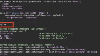
<style>
    #breadcrumb a,
    #footerarea #copyright,
    #footerarea form.zp-form.zp-editable .formbuttons input.button,
    #menubutton,
    #navigation a,
    #pageSitemap .sitemap-item a,
    #xmenu,
    a.button,
    input.button {
        font-family: #val(h1FontFamily);
    }
    #footerarea #copyright,
    #footerarea #search,
    #footerarea #xmenu,
    #footerarea form.zp-form.zp-editable .formbuttons {
        display: flex;
        justify-content: center;
        flex-wrap: wrap;

        [user='1028']media[/user] only screen and (max-width:768px) {
            body {
                font-size: 1.1em;
            }
            #header .flex-caption {
                margin-top: 0;
                padding: 0;
            }
        }
        [user='1028']media[/user] only screen and (min-width:#val(desktopView)px) {
            #breadcrumb .wrapper,
            #pageSitemap .wrapper,
            #topline .wrapper {
                display: flex;
                justify-content: center;
            }
            #webinfo {
                padding: 10px 40px 0 100px;
            }
            #navigation > div > ul > li.active > a.active:after {
                content: '';
                position: absolute;
                top: 42px;
                left: 15px;
                width: calc(100% - 30px);
                height: 2px;
                background: #val(menuHoverFontColor);
            }
            #navigation > div > ul > li.active:first-of-type > a.active:after {
                left: 0;
                width: calc(100% - 15px);
            }
        }
        #topline.smaller {
            opacity: 0;
        }
        #footer > .wrapper > #copyright,
        #navigation #search,
        #navigation #xmenu,
        #topNav {
            display: none;
        }
        div.zpgrid div.zpRow.hiSlider {
            margin-top: -#val(contentPaddingTop);
            margin-bottom: calc(-#val(contentPaddingTop) / 2);
        }
        [user='1028']media[/user] only screen and (min-width:#val(desktopView)px) {
            div.zpgrid div.zpRow.hiSlider {
                margin-top: calc(-#val(toplineHeight)px - #val(contentPaddingTop));
            }
        }
        a.button,
        input.button {
            border: 2px solid #val(buttonInactiveFontColor);
        }
        a.button span,
        input.button {
            padding: 9px 25px;
        }
        a.button:hover,
        input.button:hover {
            border: 2px solid #val(buttonHoverFontColor);
        }
        #gotoTop a {
            line-height: 32px;
            color: #val(gotopInactiveFontColor);
            border: 2px solid #val(gotopInactiveFontColor);
        }
        #gotoTop a:hover {
            border: 2px solid #val(gotopHoverFontColor);
        }
        #footerarea #copyright,
        #footerarea #search,
        #footerarea #xmenu {
            margin-bottom: #val(articleareaSpacing);
        }
        #footerarea #xmenu a {
            padding: 0;
            border-top: 0;
        }
        #footerarea #xmenu a:after {
            content: "|";
            padding: 0 15px;
        }
        #footerarea #xmenu a:last-of-type:after {
            display: none;
        }
        [user='1028']media[/user] only screen and (max-width:667px) {
            #footerarea #xmenu {
                flex-direction: column;
                align-items: center;
            }
            #footerarea #xmenu a:after {
                display: none;
            }
        }
        #footerarea #search {
            float: none;
            margin-top: 0;
            margin-right: 0;
            padding: 0;
            height: 47px;
            line-height: 47px;
        }
        #footerarea .zpsearchform input {
            height: 47px;
            line-height: 47px;
            padding: 0 47px 0 20px;
            border-width: 2px;
        }
        #footerarea .zpsearchform button {
            width: 47px;
            height: 47px;
            line-height: 47px;
        }
        #footerarea form.zp-form.zp-editable .formbuttons input.button {
            color: #val(buttonHoverFontColor);
            background-color: #val(buttonHoverBackgroundColor);
            border: 2px solid #val(buttonHoverFontColor);
        }
        #footerarea form.zp-form.zp-editable .formbuttons input.button:hover {
            color: #val(buttonInactiveFontColor);
            background-color: #val(buttonInactiveBackgroundColor);
            border: 2px solid #val(buttonInactiveFontColor);
        }
        [user='1028']media[/user] only screen and (max-width:479px) {
            .responsivelayout div.zpRow .zpColumn:not(.styled) {
                margin-bottom: #val(paragraphSpacing) !important;
            }
        }
    }
    [user='1028']media[/user] (max-width:720px) {
        .j-module h1 {
            font-size: 12px !important;
        }
    }
</style> )
) 

 Eigentlich sollte ich es besser wissen... aber Homepages und -Design ist schon was ganz anderes, als nur Fotografieren!












 (Absolut wichtig... kann aber nirgends eingebracht werden?)